Brand extension
Racing Integrity Board
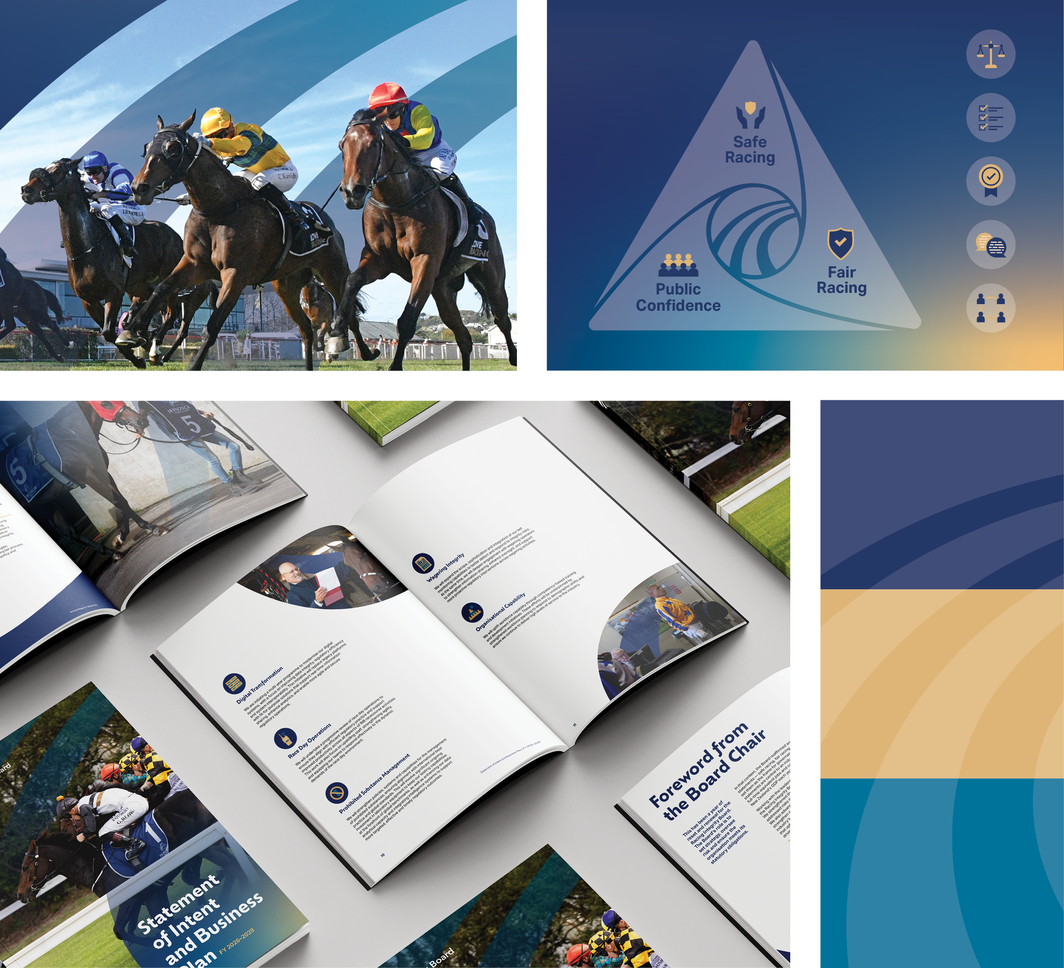
The Racing Integrity Board SOI needed a new design after creating a new logo. The SOI needed an appropriate tone reflecting a dynamic, forward-looking organisation with a focus on thought-leadership and a human element whilst also ‘not looking too flashy’. The overall design draws on the dynamic movement of the logo overlaid with human-centric photography. This style has also been extended to other publications and event collateral.